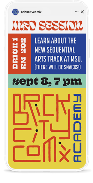
Brick City Comix Academy at MSU
Branding a Midwestern university’s comics program

Brick City Comix Academy is the new sequential art track program at Missouri State University. Through exploring the medium of comics as auteurs, students in this program develop unique voices through study and practice as writers, artists, and designers.
I was asked to create a logo that would appeal to an audience of young people in their late teens/early twenties. Indie comics exist within the greater world of DIY culture, zines, and other self-published media, and a new generation of creators are using a range of mediums both traditional and new to tell their stories.
My Role
Logo
Social media graphics
Software Used
Adobe Illustrator
Adobe Photoshop
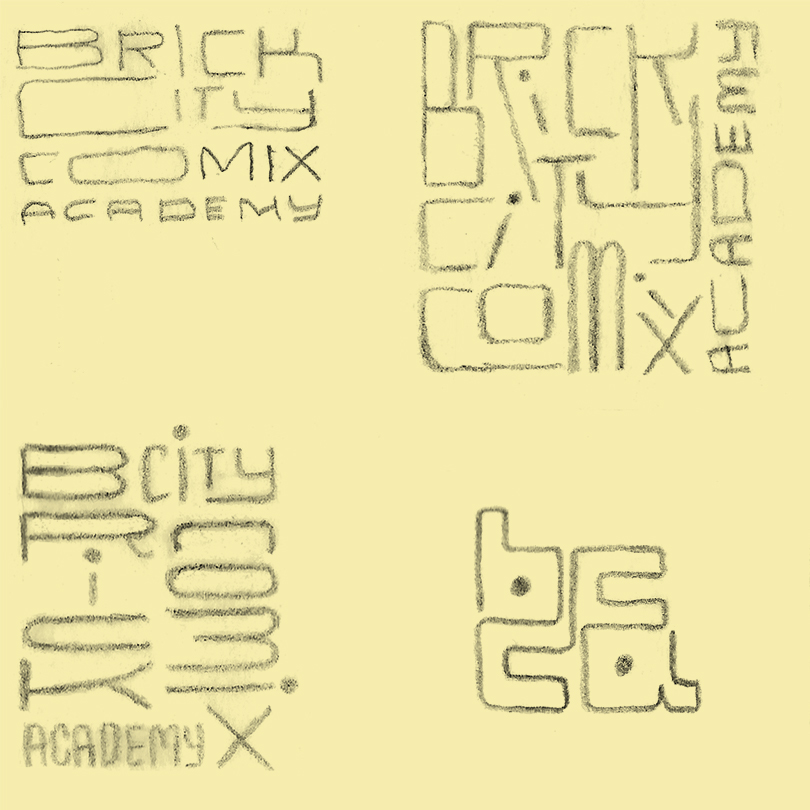
Initial sketches
I worked with illustrator and MSU professor, Cole Closser to develop the look and feel of the program’s branding. “Aware of the past, but alive and fresh” was a starting point for my sketches. Cole referenced my work on the Krazy & Ignatz series of books, in which my aim was to repackage traditional comics in a totally fresh and bold way that would appeal to a new generation of readers.
“Brick City,” home to MSU’s art department, is a group of buildings that were originally used to manufacture both ice and cheese. I was inspired by the interlocking quality of brick work in many of my first sketches. I was also struck by how the multi-paneled layout of comics pages had much in common visually with bricks and mortar.
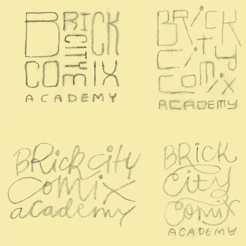
Continued exploration
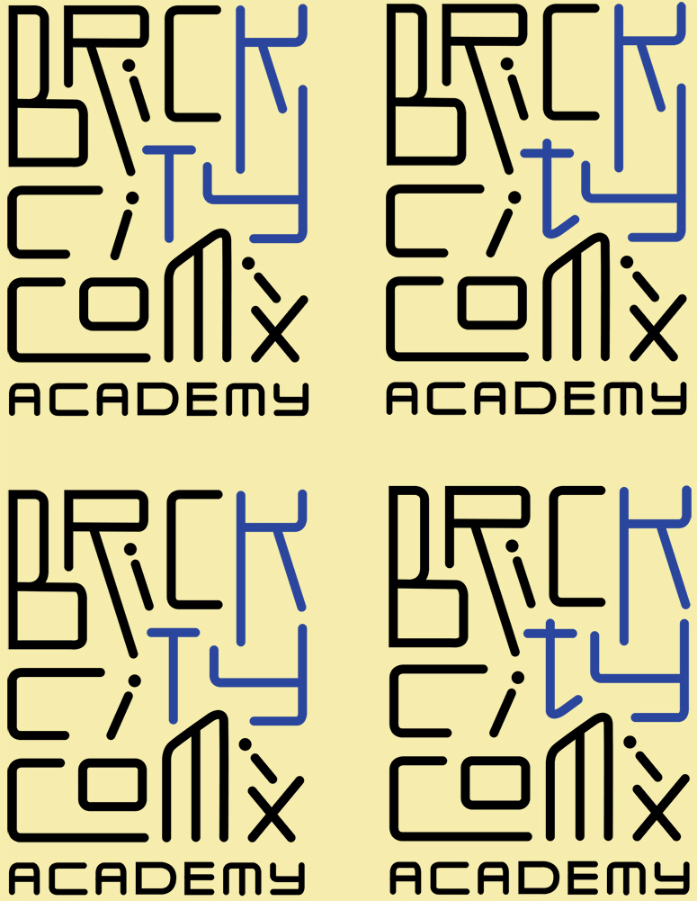
The art department faculty chose a logo direction and encouraged me to keep riffing on the quirky, bouncing letterforms. I continued to sketch both in pencil/marker, and digitally. I tried everything from wispy to big and chunky letterforms. Stylistic points of reference included classic MTV graphics and 90s Nickelodeon.
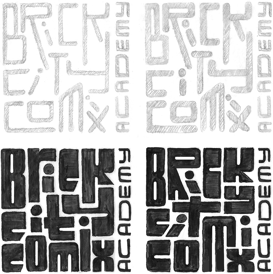
Readability considerations
At this point, I showed the logo to people of many different ages. As I suspected, the younger crowd could decipher the words more easily than say, senior citizens. I passed along this ad hoc research to the faculty, and after some discussion, we decided this was actually okay. The target audience for the logo and the new program are younger adults who are creative and pride themselves on having a more sophisticated visual literacy.
I felt I could still continue subtly refining the K, T, and Y to maximize readability without losing too much of the edgy, experimental quality.
Final logo
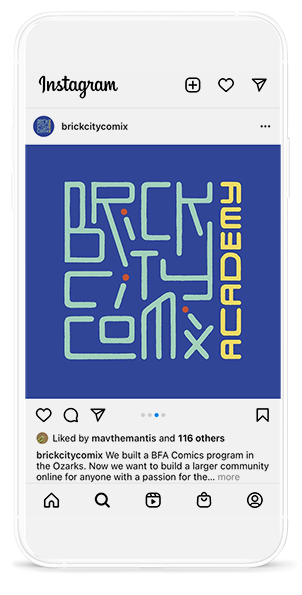
After shifting the word “Academy” to the right to create a more square format, everyone was happy. Using a combination of pencils and live trace, I roughened up the letterforms slightly to add some warmth and to avoid any sterile, vector qualites.

Choosing a color palette
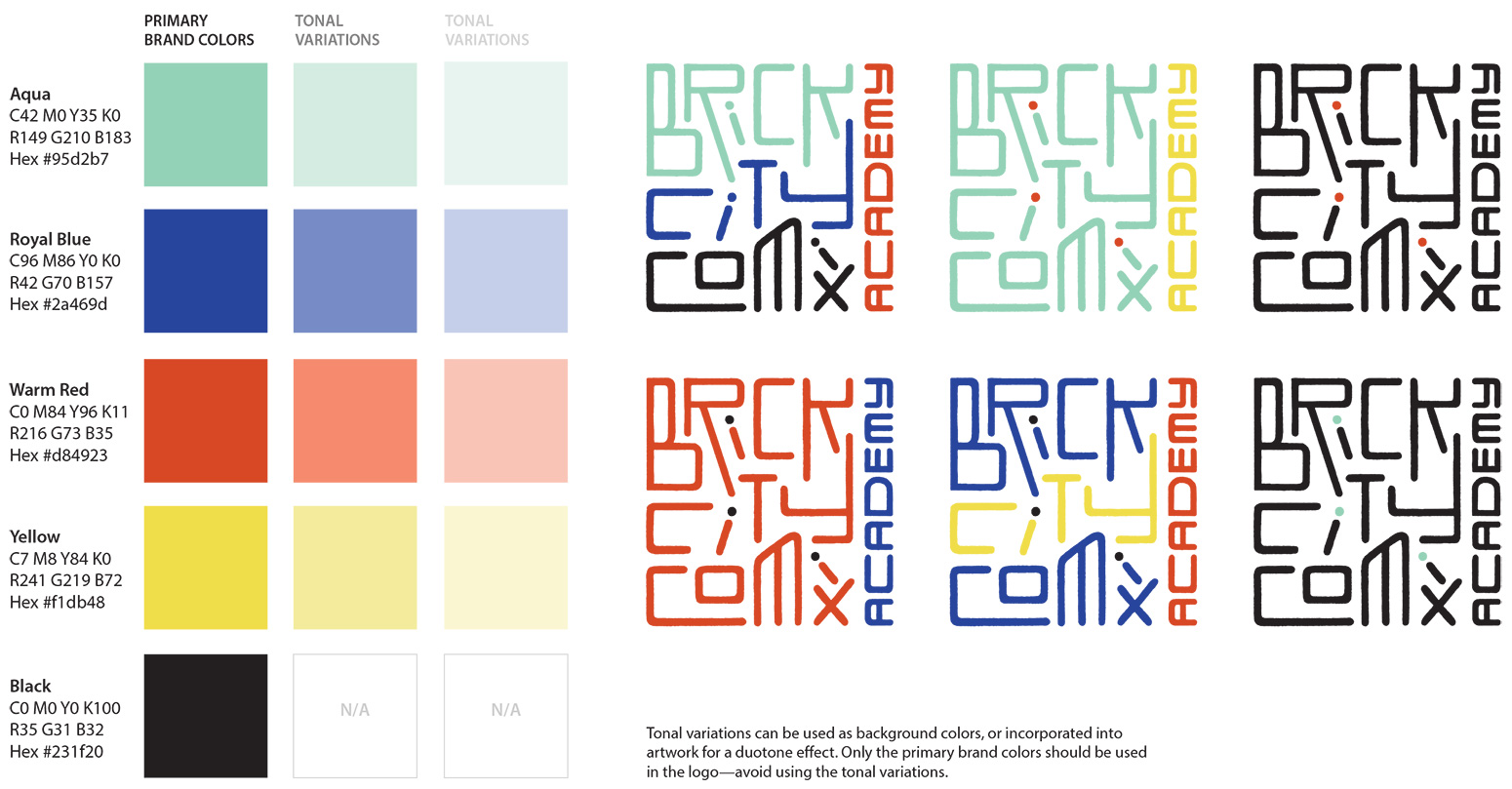
Cole and I agreed that Brick City Comix Academy should draw color inspiration from the world of risograph printing, a digital/screen printing hybrid that had its heyday in the 80s and 90s and is enjoying a resurgence in popularity in the DIY printing scene. I wanted to give the program a fair amount of flexibility with how the logo might be used by specifying a palette of five colors; some logo applications might be more restrained and use just two colors, others could feature all five colors. Each application would feel like part of the same family as long as the designer chose from within the palette.
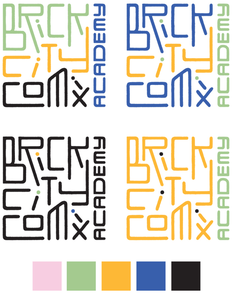
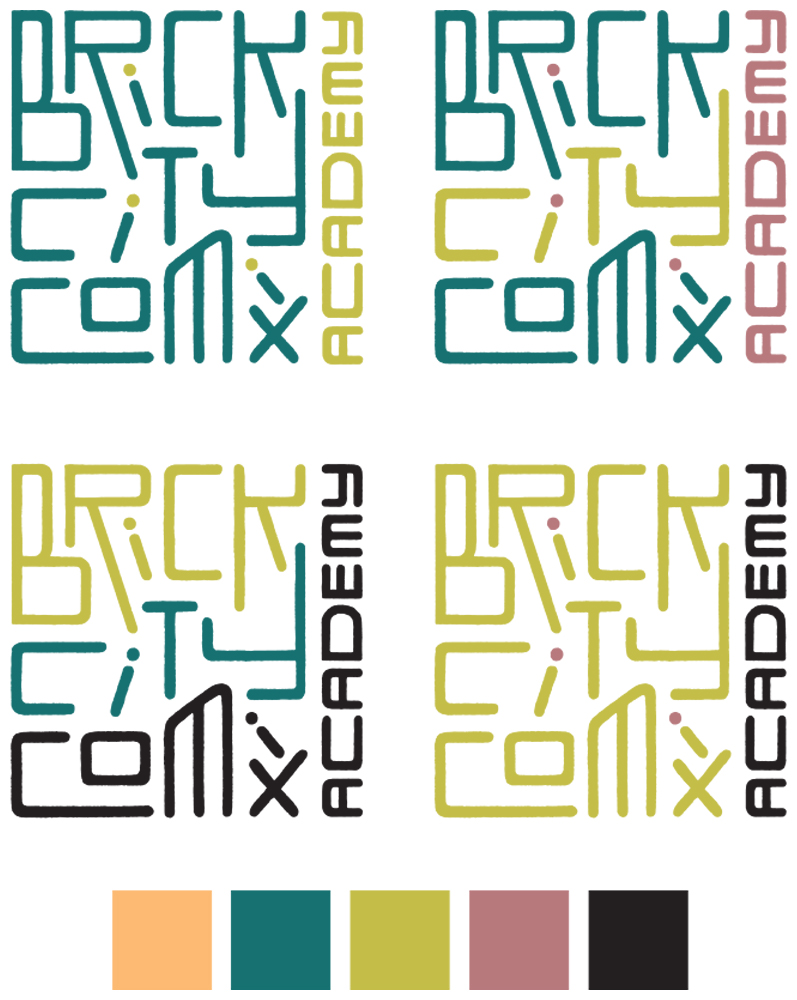
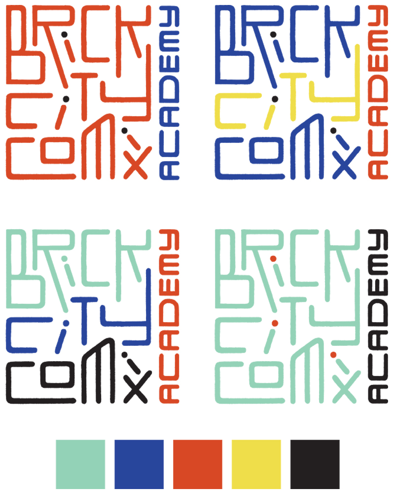
Final color palette
Our final palette felt fun, fresh, yet totally throwback. In addition to the core palette, I gave the program options for tonal variations that could be used for backgrounds and other elements in promotional materials.
Social media
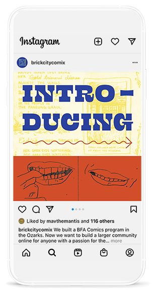
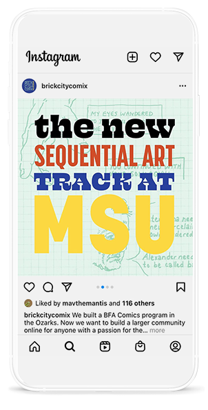
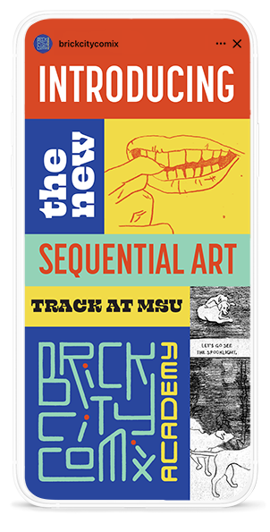
I started the program off with an Instagram post and story, using student comic art to add warmth and texture. These posts brought many new followers to the account and resulted in quite a few student enquiries about the program.
