OneRoof Roommate Finder App
Designing a new experience in finding a roommate
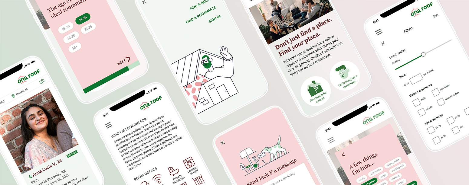
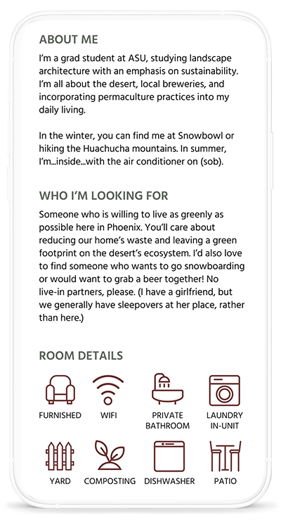
OneRoof is a project I created as a proof of concept for a roommate finder app targeted toward people in their 20s and 30s. Users are guided through a personality quiz by selecting personality characteristics, likes and dislikes, and lifestyle traits using Tinder-style buttons. Using a more nuanced and targeted approach toward making compatible matches, OneRoof aims to make finding a roommate a more fun and ultimately successful process for young people just starting out.
UX/UI design
Branding
Web copy
Software used
Figma
Adobe Illustrator
Adobe Photoshop
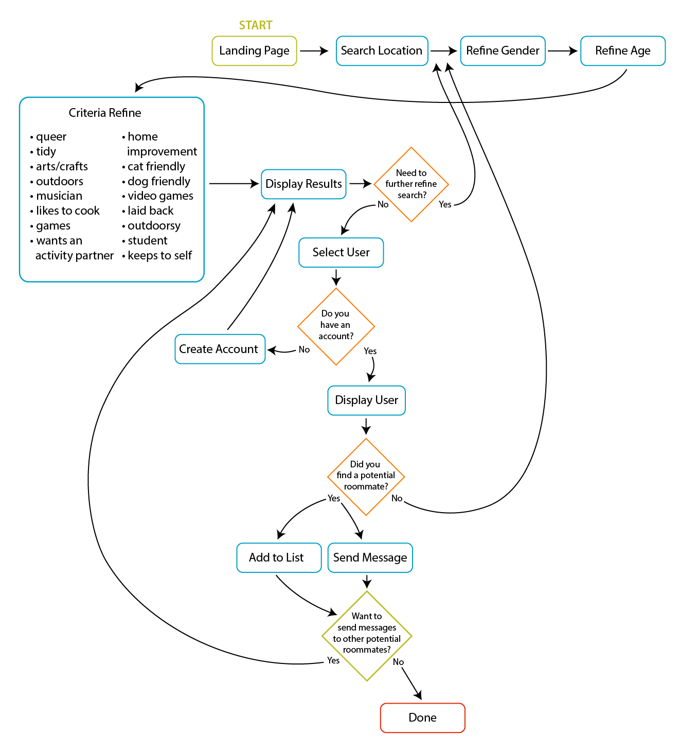
Creating a task flow
For this proof of concept, I wanted to focus on creating a fun and easy quiz style search experience for a first time user of OneRoof. Working under the assumption that a new user would not yet have an account with OneRoof, the search funnel guides the user through several screens of questions and displays a selection of potential matches. The user must then create an account before gaining access to detailed profiles.
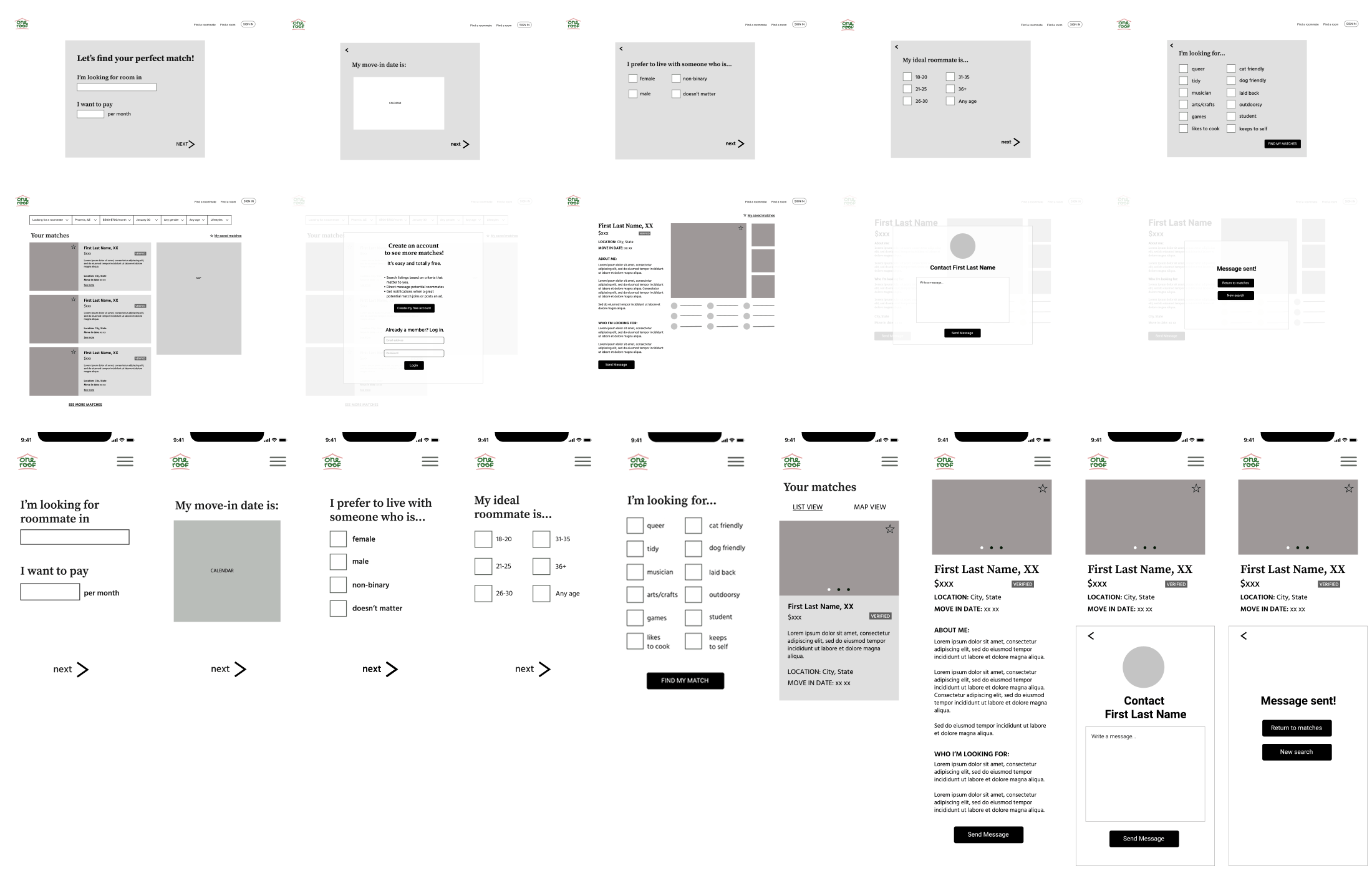
Low fidelity wireframes
After fine-tuning the task flow, I created analog sketches before working through a series of low fi digital wireframes for the search funnel process.
Branding
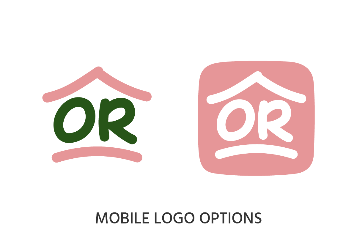
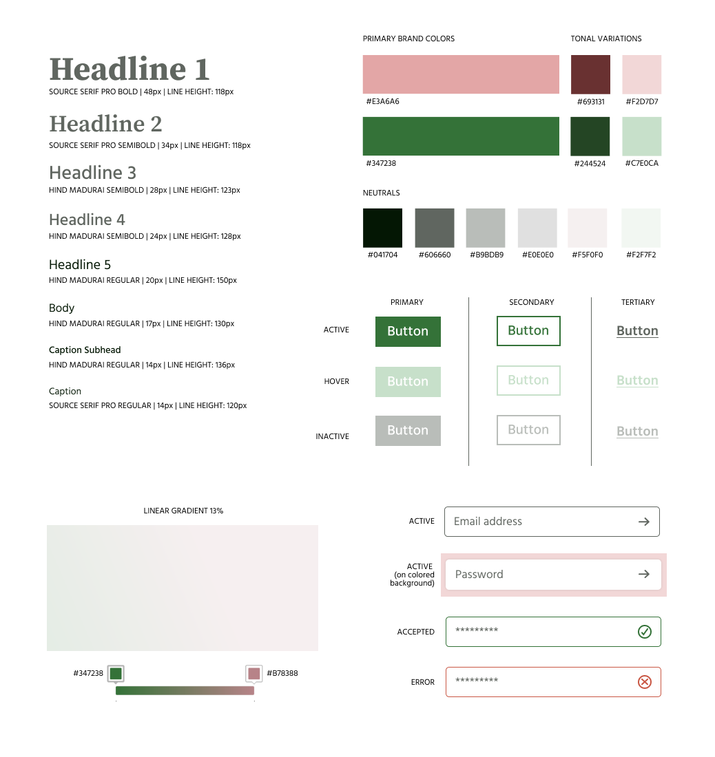
I created a suite of responsive logos that will work on both desktop and mobile applications. I included brand colors and their tonal variations, as well as a selection of neutrals that pair well with the core brand colors.
Illustrations and icons
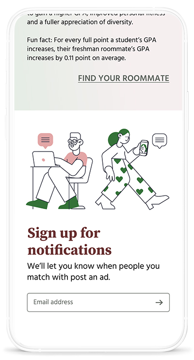
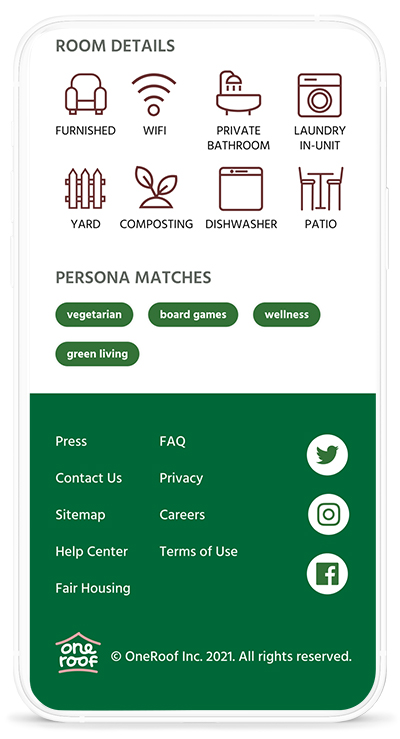
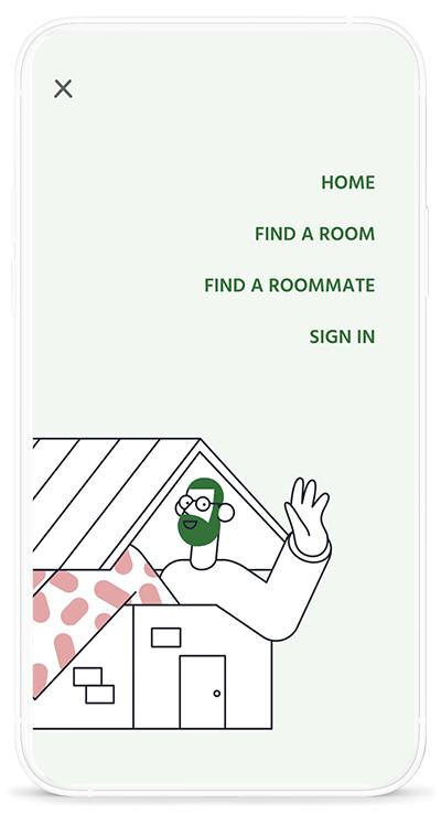
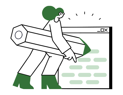
Using Anna Goldes’ suite of Pablita illustrations as a starting point, I customized stock illustrations and created original illustrations for the OneRoof site.


Iterating on the landing page design
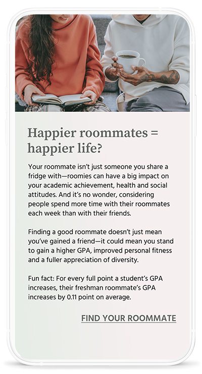
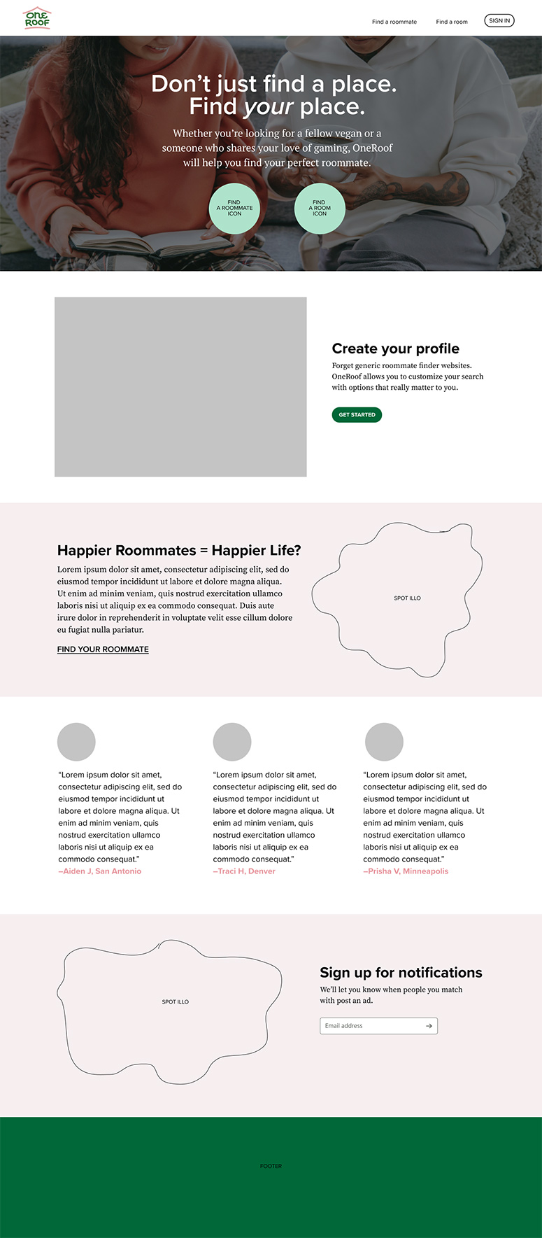
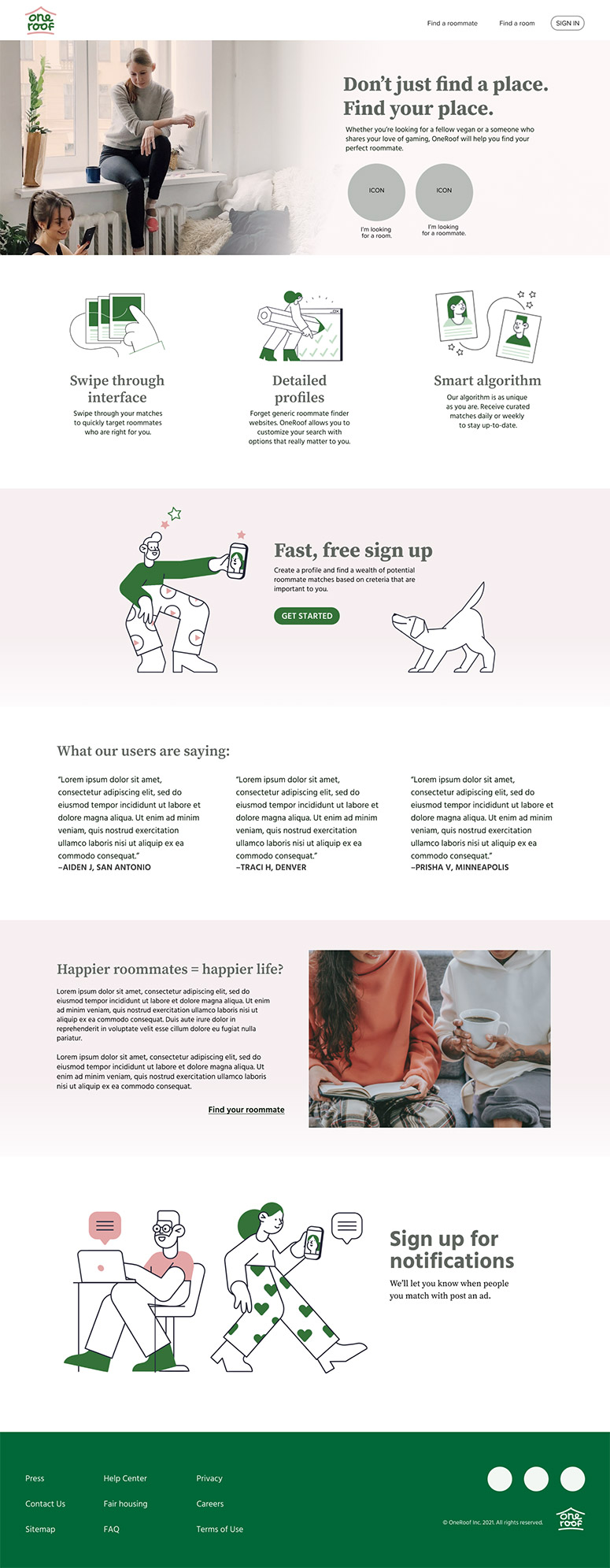
Testing early versions of the landing page resulted in feedback that the photography felt too dark and/or busy. In exploring design options in these earlier iterations, I was able to find a balance between photography and illustration, and to create a cohesive look and feel between all three.
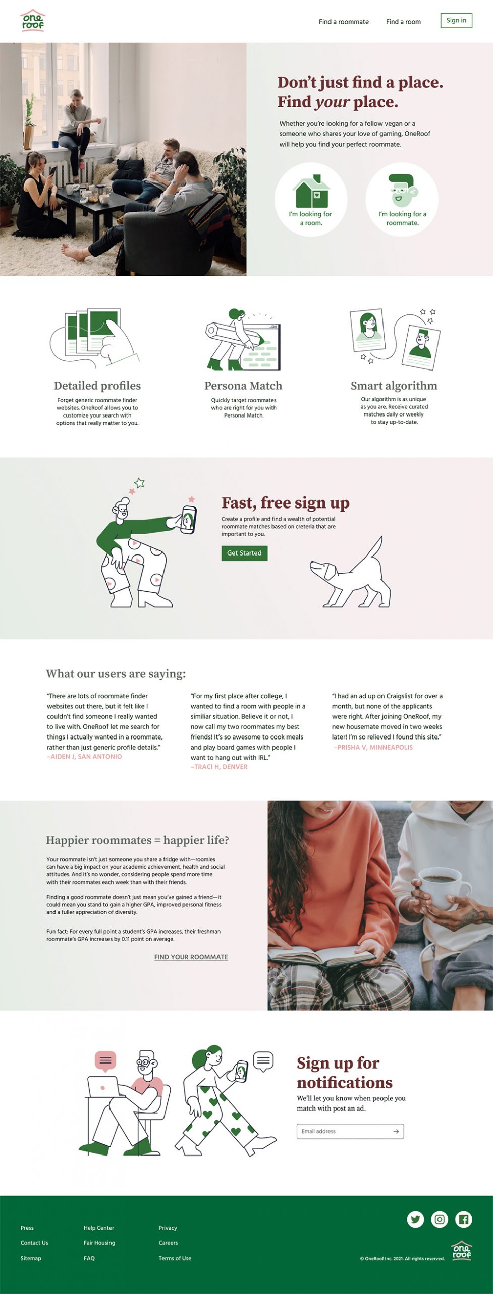
The final landing page
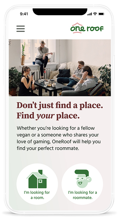
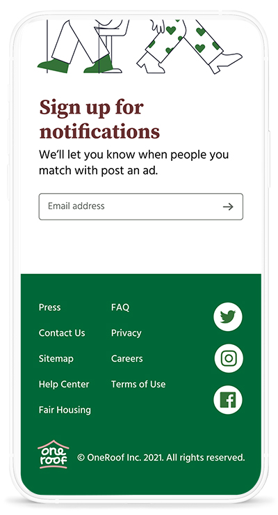
The final landing page feels clean and structured while still maintaining a sense of warmth and friendliness. Users during testing mentioned how much they loved the subtle gradient backgrounds.
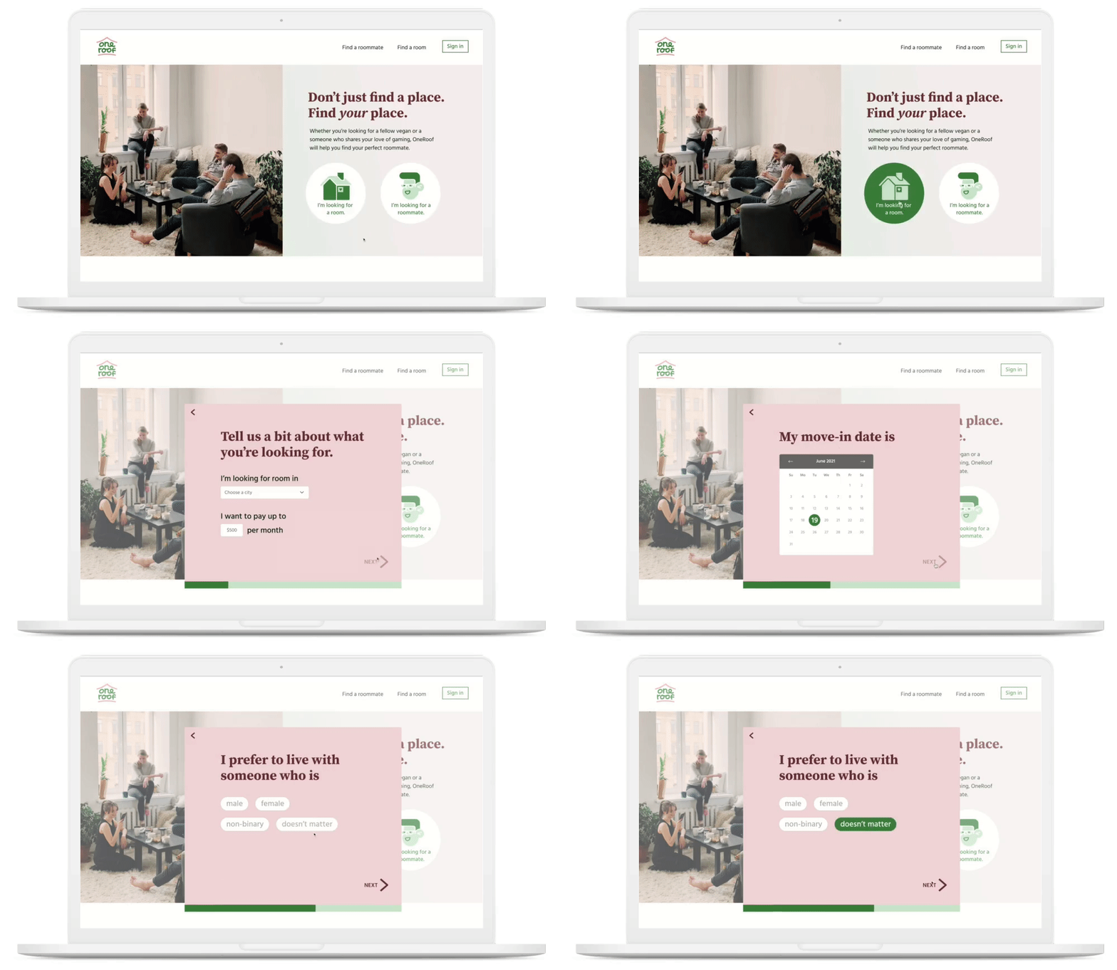
The search funnel
In testing a search funnel design that used both check boxes and toggle buttons, I was provided with feedback that the toggle buttons were easier to use and were the most straightforward option in terms of visual affordance. I created versions with multiple sizes and landed on the ideal dimensions for fitting in lots of information and keeping the screen tidy.
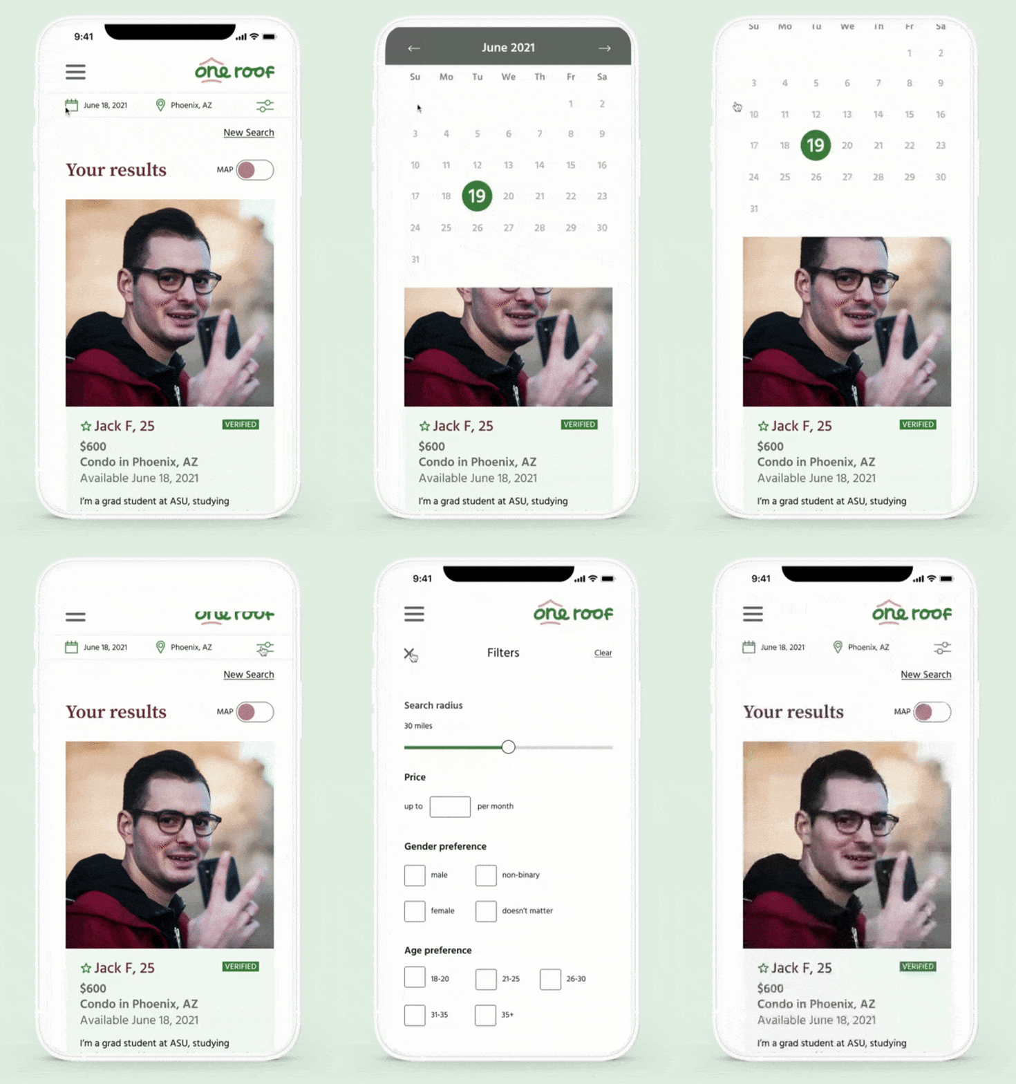
Filters
Clean, elegant filters allow the OneRoof users to intuitively zero in on their perfect roommate match using criteria that matters to them.
Log in
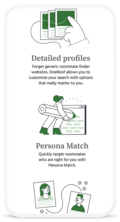
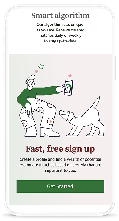
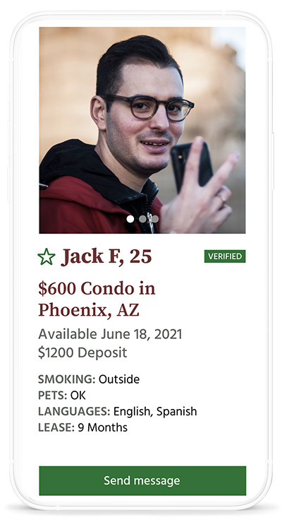
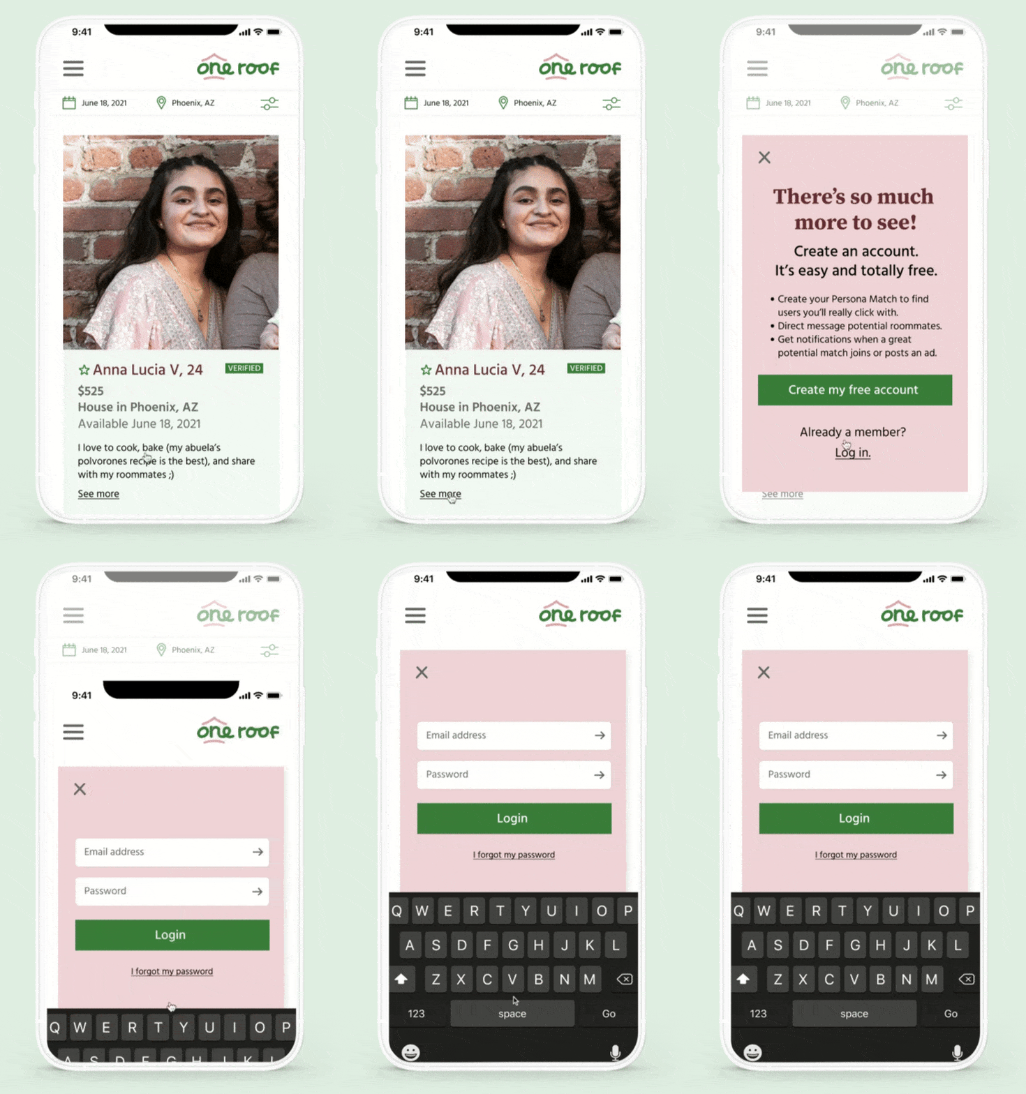
The log in prompt details all the ways an account with OneRoof will allow users to find their perfect roommate match.
Log in
The log in prompt details all the ways an account with OneRoof will allow users to find their perfect roommate match.

Send a message
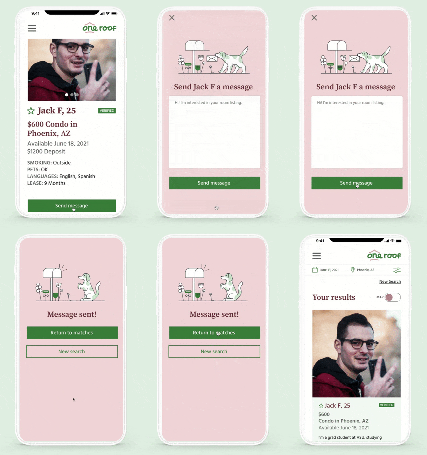
The “send message” screen includes a simple, fun illustration of Howser, the OneRoof mascot.
