Krazy & Ignatz: the George Herriman Library
A design refresh for one of the 20th century’s most lauded cartoonists
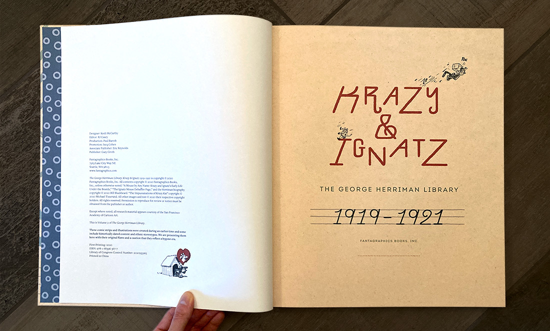
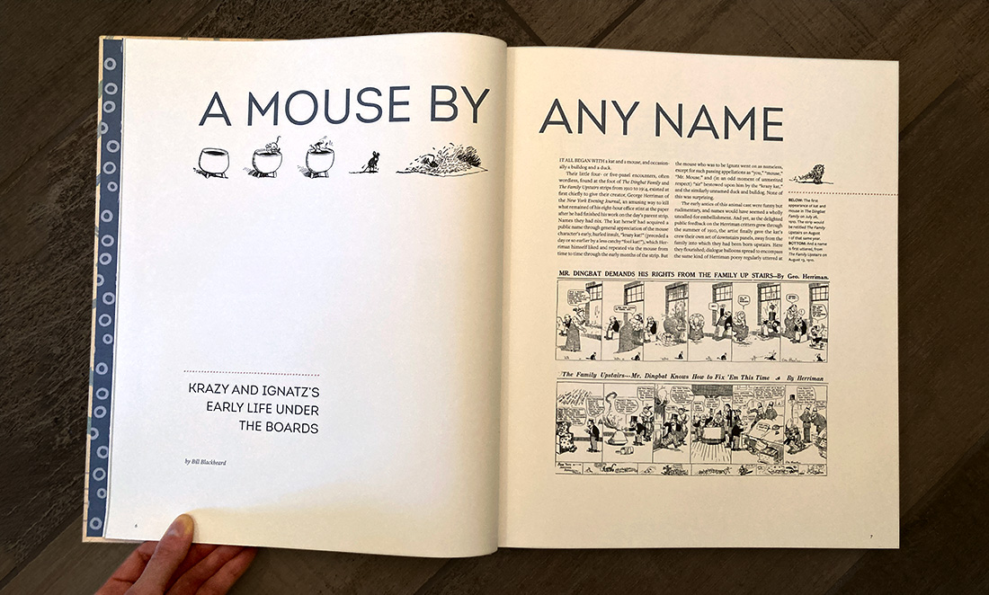
Krazy & Ignatz: the George Herriman Library collects the Sunday cartoon strips of one of the greatest minds in early 20th century illustration. George Herriman, a Creole American, was born in New Orleans and raised in Los Angeles, and both jazz and the American Southwest played critical roles in his work. Herriman’s formal experimentation, poetic language, and playful settings were hugely influential in both the comics and greater art worlds. (Poet e.e. cummings even wrote an introduction for the first book collection of the strip!)
This series was originally published by Fantagraphics in a paperback format with packaging designed by Chris Ware. Long out of print, the company decided to reprint the series for a new generation of readers with an updated look and feel. Both volumes 1 and 2 have garnered Eisner nominations for best archival collection.
(If you like book design, check out almost every book cover I’ve ever designed—plus an ode to the death of print— here.)
My Role
Cover design
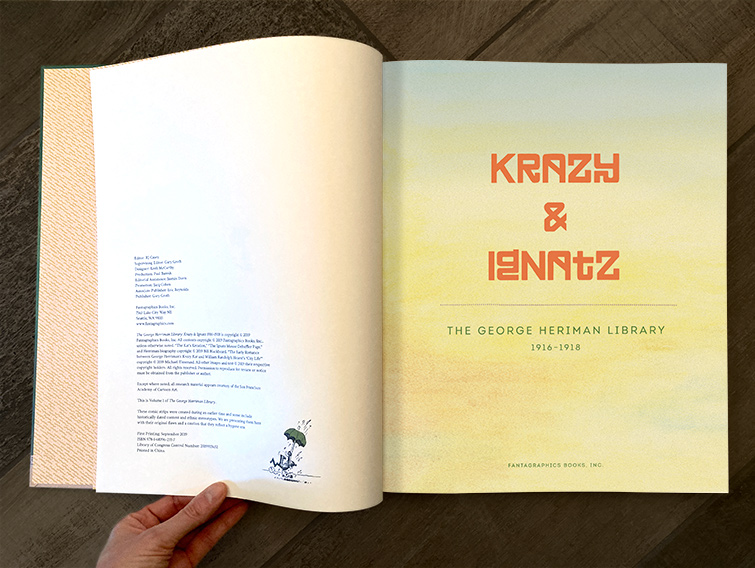
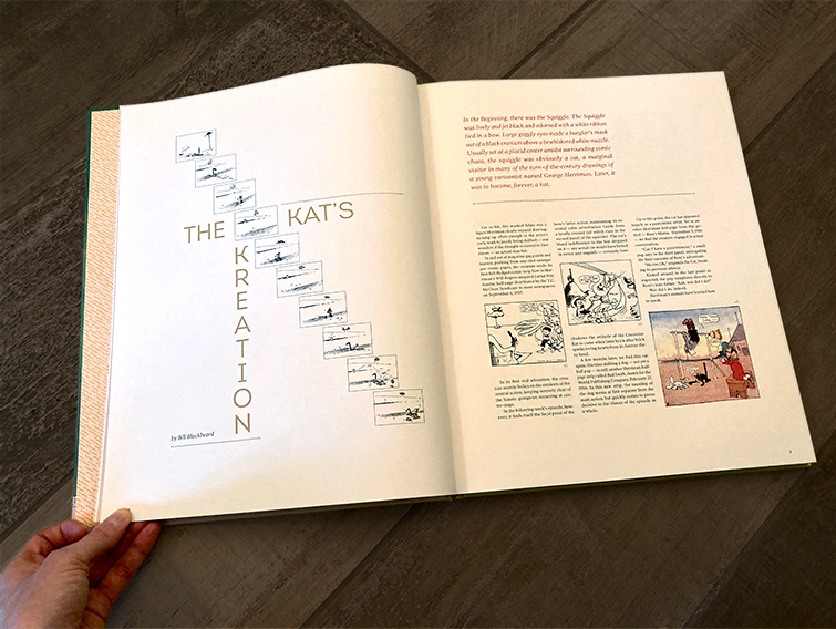
Interior design
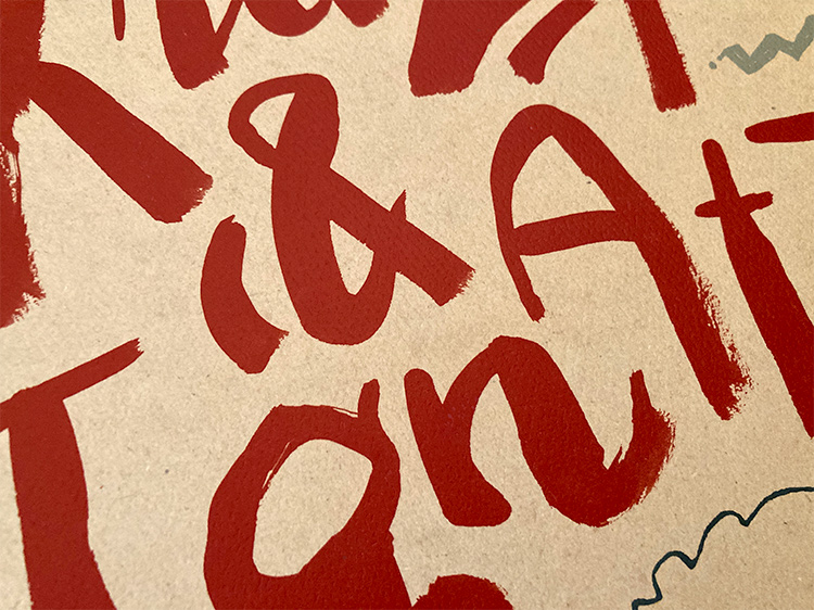
Lettering
Pre-press
Software Used
Adobe InDesign
Adobe Photoshop
Adobe Illustrator
The challenges of series design
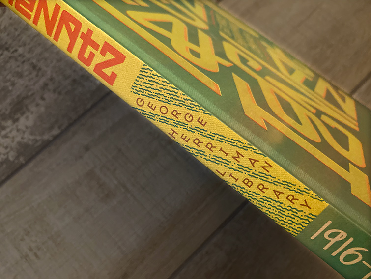
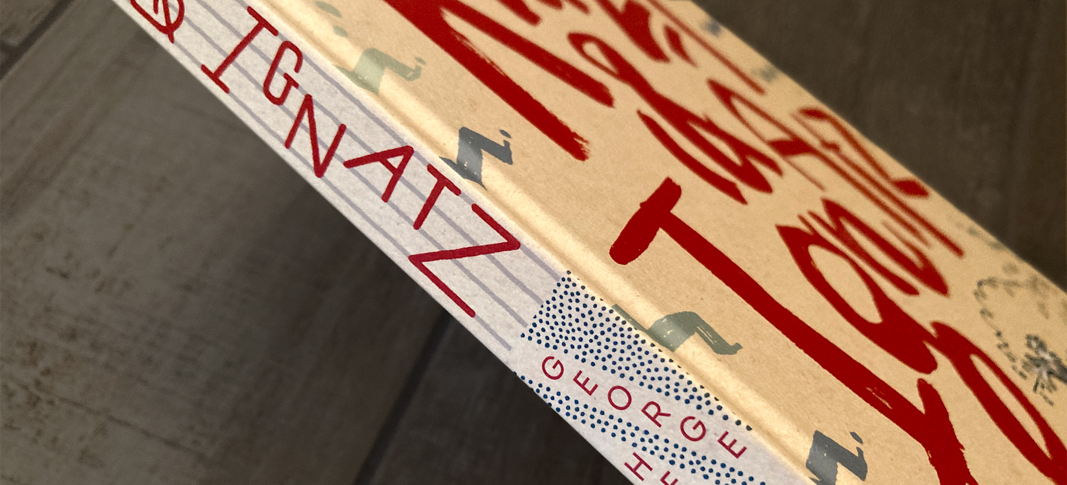
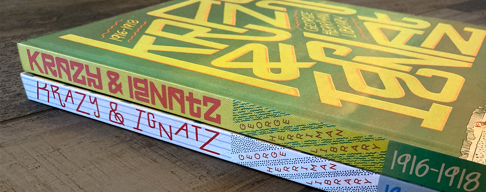
In an ideal world, book series designers would be able to decide how each cover will fit into a series look and feel well in advance. Small details like how the spines in each volume will look together on a shelf must be considered. The reality is that a designer will create a first volume or two and must stick to those initial decisions for sometimes dozens of future books. Series designers must be able to anticipate the challenges of forthcoming books in a series that possibly even been created yet.
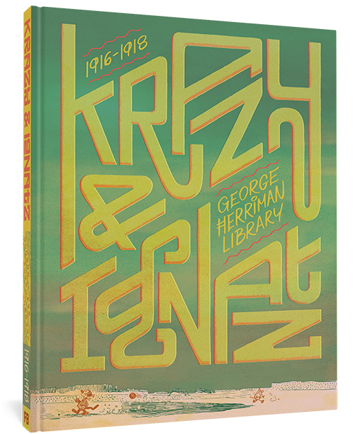
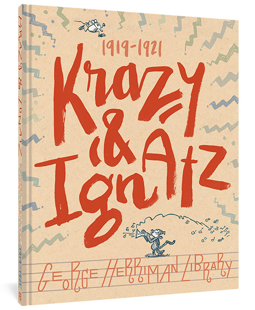
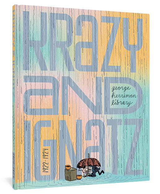
Unlike a series design for, say, Disney, I had a huge amount of creative freedom to determine the look and feel of these books. George’s Herriman’s work has been compared many times to the qualities of jazz, with themes loosely riffed upon and creative iteration. I also wanted to maintain that ability to riff on a central theme without the burdensome constraints of a too-strict format. I landed upon the concept of 9/10ths: each cover will feature a big, bold element that takes up 9/10s of the surface area, with small supporting elements for contrast. This approach allows me to play with scale and creates layouts that are easily spotted from across the room.
Size considerations and special finishes
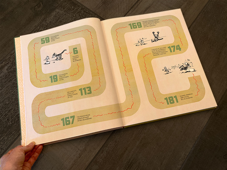
Krazy & Ignatz was first printed in the broadsheet The New York Evening Journal. This oversized newspaper format was ideal for studying Herriman’s detailed panels. The first Fantagraphics series was printed at around 9 x 12 inches. Because we had good quality scans that would allow for a bigger reproduction of the art, I made the decision to design the new series at 11.3 x 13.8 inches. This size makes Herriman’s wonderful little details easier to see, and allows the the art to breathe within book margins.
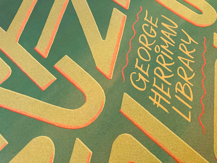
Each cover has an edge-to-edge stamped pattern that creates surface texture. (This effect, called “graining,” is generally more cost effective than an actual textured paper or book cloth.) The first book in the series mimics book cloth, the second watercolor paper, and the third will feature vertical lines mimicking rainfall. Additionally, the first cover in the series features a 4-color design with an extra Pantone ink to make the pink really pop.
