Walt Disney
Packaging one of the world’s most recognizable icons
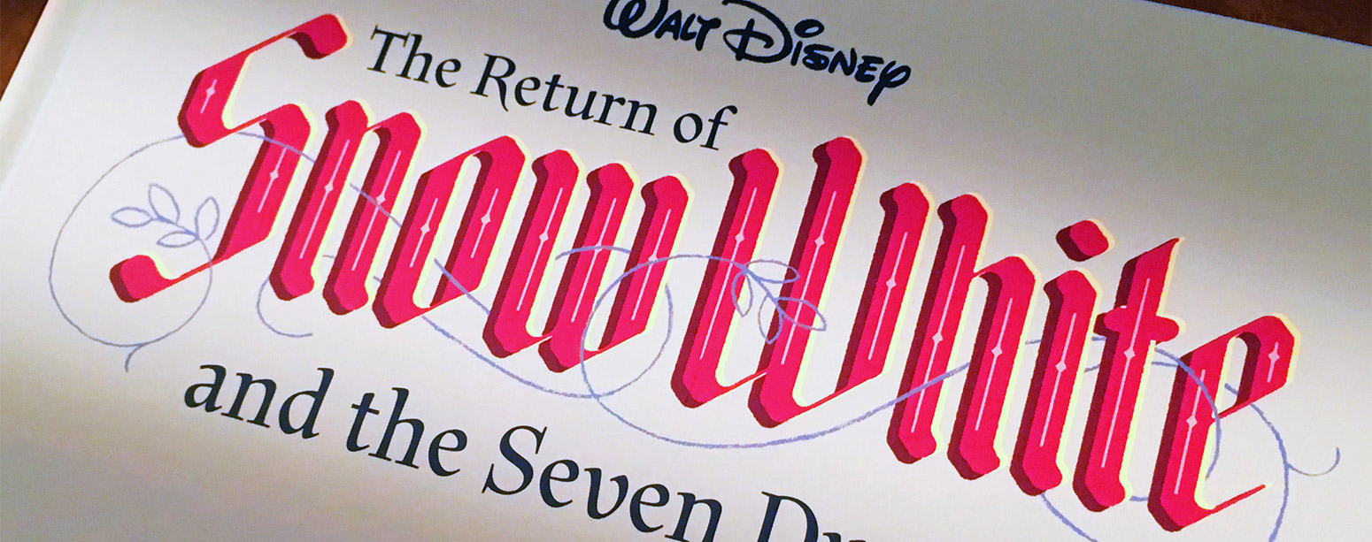
Designing for Walt Disney is as rewarding as it is challenging. Disney requires strict adherence to style guides and navigating through a complex approvals process, and a designer must be flexible and willing to make careful edits to numerous small details. Designing a series of books is all about designing a system, and one must consider how elements can be used in different design context and anticipate future changes to the format. Each volume must look good as a standalone book, but should also be easily identified as a member of a larger family.
My Role
Branding
Book design
Pre-press
Software Used
Adobe InDesign
Adobe Illustrator
Adobe Photoshop
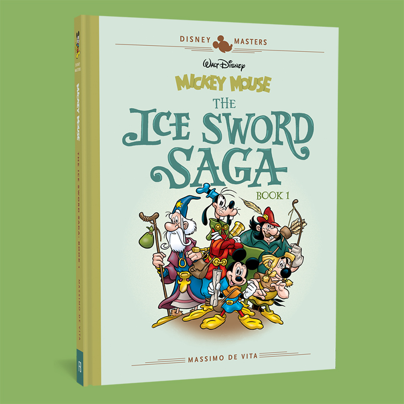
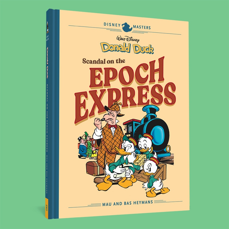
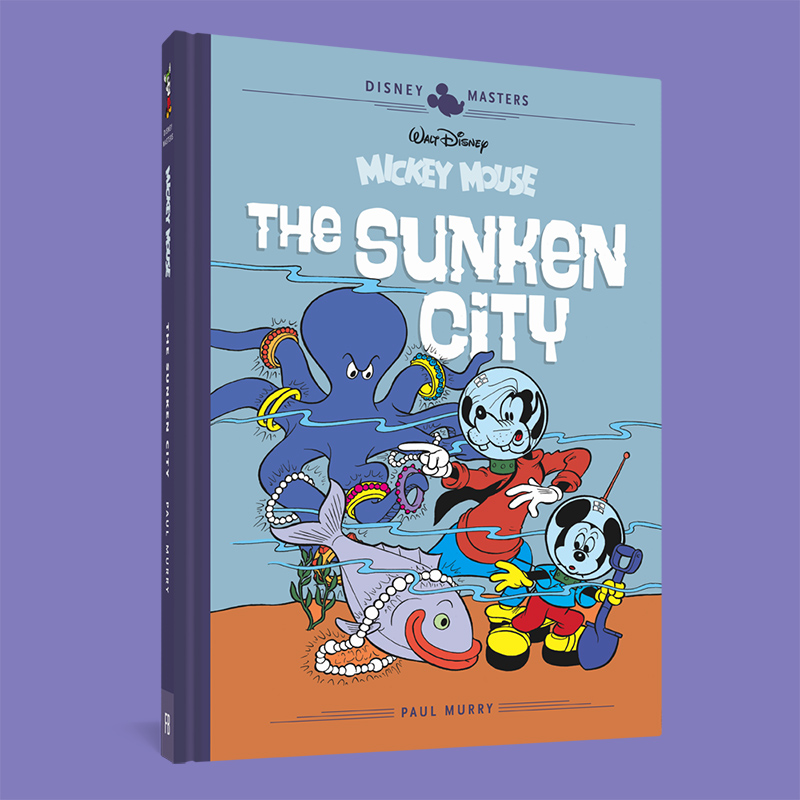
Disney Masters
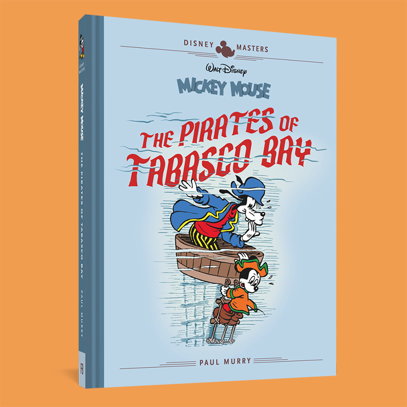
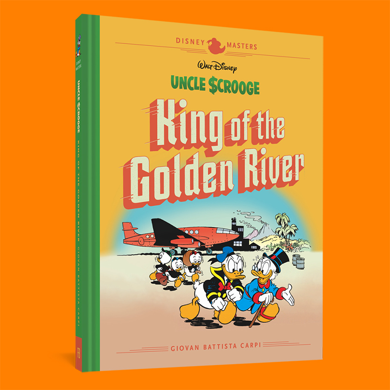
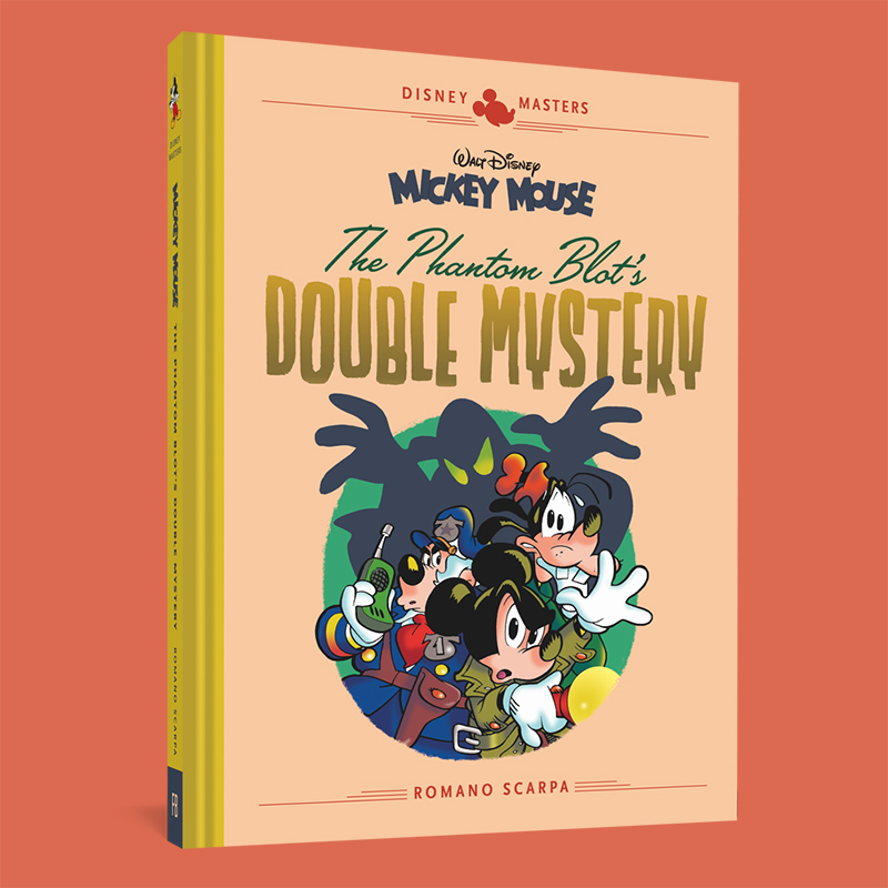
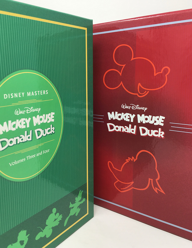
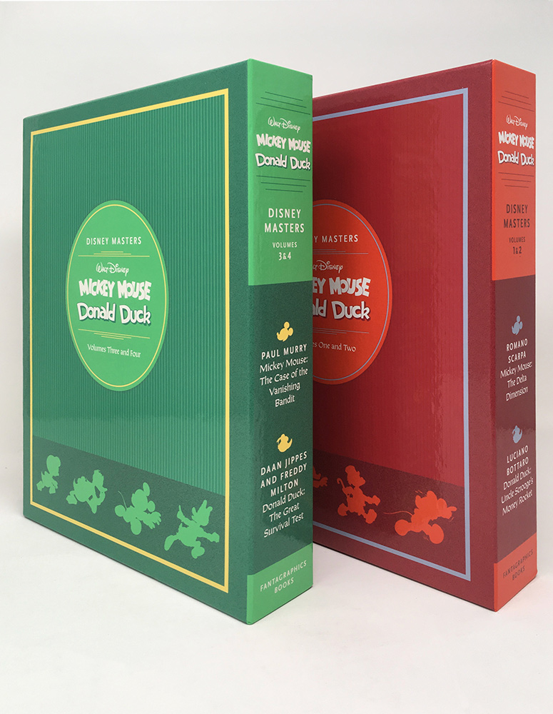
Disney Masters is a series of books that reprints work from a range of European cartoonists working in the 20th century.
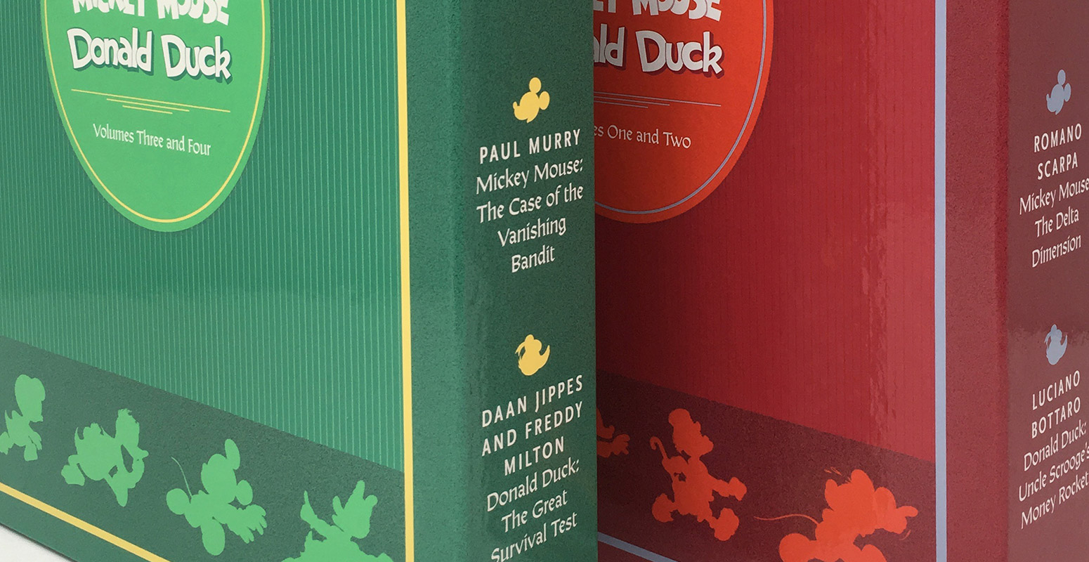
I designed the series look and feel, as well as the slip cases that collect the books into box sets. I’m always looking for new ways to expand my skill set, so I even acted as editor on a few of the early volumes. I aimed to keep the design for this mid-century material playful and light-hearted, while maintaining the sophisticated design aesthetic that Fantagraphics Books is known for.
My design strategy prioritized the ability to easily swap out illustration elements and colors so that future designers of varying skill levels could work on these if necessary.







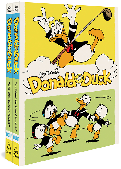
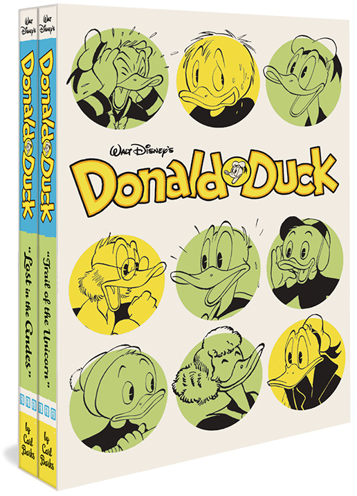
The Carl Barks Library
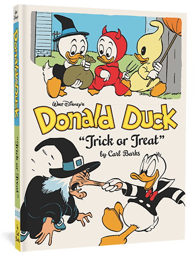
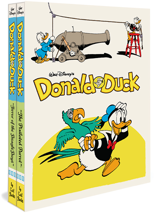
Library In addition to Disney Masters, I worked on many volumes of The Carl Barks Library (series design by Jacob Covey). Carl Barks’ work is fun and high energy, and I wanted to bring those qualities to the box set designs.









Carl Barks minis
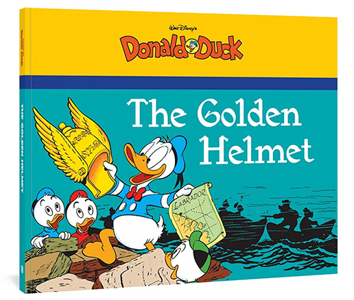
These are a three book series of classic Donald Duck comics perfectly sized for little hands.


Fun with barcodes
I’m always looking for ways to brighten up the dry or boring details of a layout with unexpected whimsy. Barcodes are a memorable place to do this.
